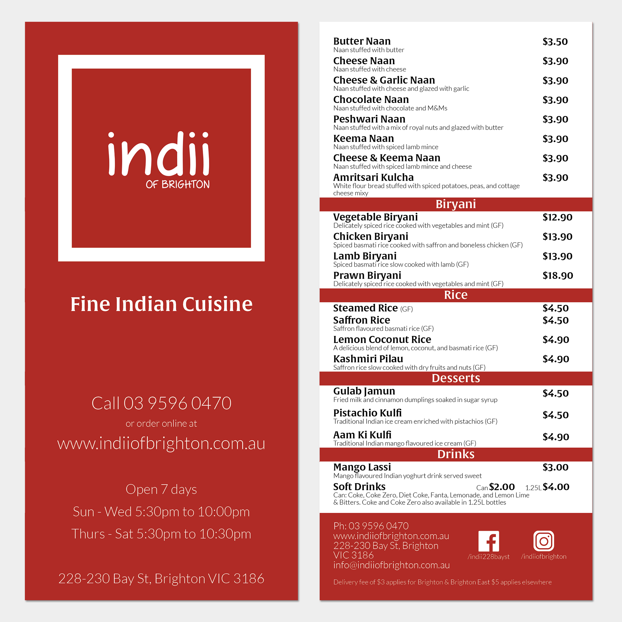
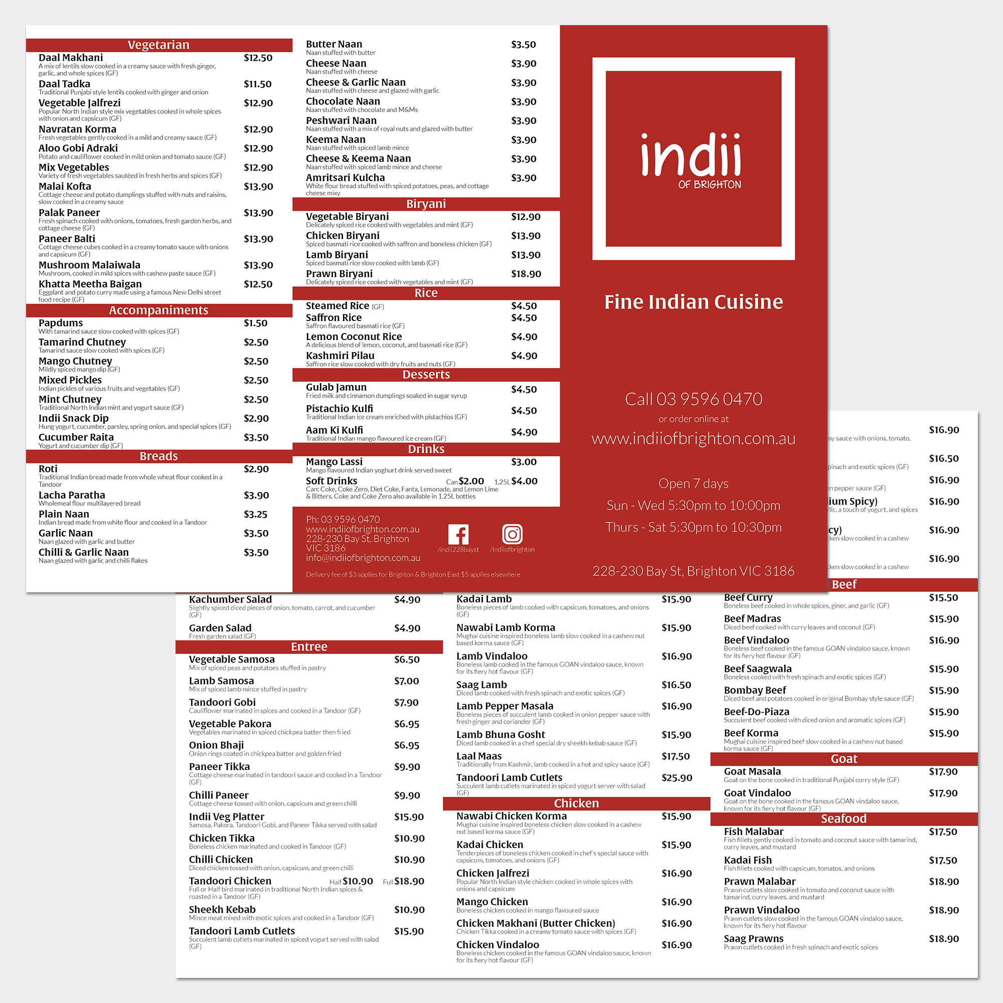
I felt like I hadn’t worked closely with a large amount of type and formatting for a while so I set about giving my local curry house’s takeaway menu a makeover.
I hadn’t worked on a menu (takeaway or otherwise) before and now have a better appreciation of how much forethought needs to go into setting up sections and individual items, including sizes/servings, on each page.
My aim for the front page was to create a hierarchy of information most important for the order of ordering food; The restaurant name, the type of food they specialise in, the means of which to order with, followed by the food itself.
The larger font is Alverata Semibold, which I chose for its curvature and oriental feel in the context of the menu, while the smaller text is Lato Light, which I settled upon as a sans-serif contrast.